Blogg

My photo
This is my Media Blogg and I will be showing forth the best works of my abilty and I hope you enjoy my page. Thank You

Wednesday 30 November 2011

Poster 2


Although there are no similarities within across the posters, I also wanted to make each one different to show development, and this one features and actual image of the setting of the film. I felt this was an important thing to incorporate as it helps for the audience to again understand what genre and type of film Take the next step  would be. As shown I have advanced from the first poster to poster 2 and feedback has told me that I have shown a sufficient amount of skills using Adobe Photoshop CS4.
I decided to make this poster black and white because as a drama I felt it would have more impact on our target audience.

Monday 28 November 2011

FILM REVIEW FINAL

The reason why I chose to go for Total Film magazine is because I wanted a film company that had a big name and make our film stand out as well.
Total film is a British film magazine published 13 times a year (every four weeks) by Future Publishing and Total Film is recognised all over the country and other countries too on the grounds that its so known its got a own unique style of layout for its film reviews. I did a lot of research on their reviews and even popped by WHSmith to check the actual magazine so I could get some ideas to insert in my own review.
The layout of there reviews are surely interesting and it caught my eyes were as the independent reviews were pretty much simple and boring but I didn’t want that impact on our audience so that’s another reason why I went for Total Film’s Magazine film review layout.
The magazine has images, text, ratings, comments and other recommended film reviews on just one film review page.

There was a few decisions I had to make when I was creating this film review because our film was a very short film and wouldn’t have had as much details as the big Hollywood films will so what I did is I drew up a quick sketch of what the Total Film reviews looked like and the converted it into “Take the next Step” Version. In most of the reviews there is a load of text and what I decided to do is that I was going to expand on our film and make it look more professional other wise there would have been like one paragraph of text.
Also I decided to go on with the way the insert images so I picked the two powerful images and expanded the size one big and another one much smaller.
I inserted in different text font to also make in more interesting like they did in the Total Film magazine. Star ratings were one thing I had to surely add in because it gives it more of the review style.
The layout overall was basically copied from the Total Film magazine so that it would fit in with the original ones from the magazine.Once
I had decided on the magazine, I decided to review a two page spread that is featured in Total Film. This particular two page spread features a review of the film True Grit. The review features one single large screenshot with the text surrounding the picture. The use of the image is important in drawing in and attracting the reader to read on. The review takes on a very neutral point of view, coming to a conclusion that the reader.


Poster Draft 1


Thursday 24 November 2011

Poster Research


The colours that are in this image are contrast colours because his right side of his face has a bright light contrasting to the left side of his face which signifies a message of a contrast happening. There are 3 main colours red, black and white and that completes the whole poster layout.

In this poster there isn’t any particular symbol except for the text in the background which tells part of what you’re going to expect in the film and also the contrasting light on Will Smith’s face. And they way they got Will Smith to dress symbolises that he is a calm wise man with a smile on his face.


The whole main figure of this poster would be Will Smith himself as the character in this film. He has the whole poster representing him and this shows that this film is going to evolve around him mostly. He is represented photographically in this poster and stand out visually in the foreground.

The message I can see in this poster is a young man who has achieved something good and is very proud at that moment of time however if you read the words behind the character we can see that they portray tragic actions and life changing experiences, these are the visual messages. Verbally would be the words we read out in our mind which is displayed as the background.
The audience for this film would be a much more mature audience so this would be recommended to under the age of 15 for any reason at all. The way I can tell it would appeal to a mature audience is because it’s a very straight forward poster no bright colours, funky text, funny characters, laughing people or anything which is a bit humorous or entertaining. It portrays that serious/mature kind of film which would have to be for mature minds to understand.

Persuasive techniques in this poster to get audience would be the simple layout of this poster and how it makes you want to watch it just so you can find out what its about because the title seven pounds doesn’t really give any message and as humans we are curious to find out things. This poster really did made that impact on wanting to know what this film is about. In the case of genre from the first look I would see drama or adventure just because of the way Will Smith is represented in the foreground of the poster and it allocates that genre.

Will Smith the star is really used as the USP because he makes the whole film more attractive in the sense that people know how he is one of the greatest actors so having him on the poster would also be one the main attraction and USP.

Attention in this poster is gained by the way Will Smith himself looks because he looks so different to what he looks like in any other film and he has grown so much older but on this poster he looks young and the way people know him as would surely attract them to the film. Secondly the title “Seven Pounds” very strange and different it makes the audience think WHAT, WHY & WHEN and that’s 3 main questions poster must make you think when you look at them because that puts a high percentage of chance that you will go out and watch the film itself.


The colours in this poster show the complete contrast between the two men in the poster and the title in red stands out and signifies that these two men are most probably brothers in this series. The person on the right is in a navy blue suit were as the girl on the left is in a black jacket these colours all show contrasts between them two.

The main symbols in this poster would be the images in the background which is in the white background we have to kind of presidential buidlings which symbolises that one in the suit is of a much higher class and most probably works in this presidential area. Then in the other brother's background we see an industrial area which also connects back to the symbolic reference of a place he would be working or his lifestyle of living.
The way the two brothers are dressed also symbolises what kind of life style they each live even tough there brothers. In a sense that brothers arent completely the same and thats the contrast between them similar to our short film the two characters in the film are brothers and they differ to each other in a what they the older brother is the coolest one and the young brother is the one who is alone and have no confidence in anything.

The main figures surely are the two brothers in the foreground and the buildings in the background because the poster evolves around them and they are the main subject of this film therefore they are the main figures in this poster. The background is another scene which plays in this poster because it gives away what makes them different from eachother as brothers. These are represented photographically and also the words on the poster gives a bright idea of what you will expect in the series.

In this poster I can visually see the message that they are trying to bring forth about Brotherhood and this message is certainly about the difference between the two brothers and how they seperately live their life in their different enviroment. This message is so obvious and it makes the poster attractive because it makes their target audience want to find out how they live differ from eachother and what exactly happens.

Seeing this poster I would feel like its a drama , action and crime genre so in my point of view their target audience would mostly like be 15+ on the grounds that it wouldnt be a simple easy series that any child could view. This would be more targeted at around 18-35 year old people because they would have the more advanced mind to view these kind of series.

The persuasive technique they used in this poster is they way the set out the two actors with there back facing eachothers and this really creates that tension between them especially because they have their own seperate background in the poster which make their tragte audience hungry to know what is going to happen next. Another persuasive technique they used are the tag line "This city has two sons" & "Only one can rule the Hill" now this is brilliant! Its bring up a major attraction on wanting to know how this is going to happen between the two brothers.

The looks of this poster signifies that the genre conventions will be action , drama and crime because there isnt any sort of bright colouring,animation,jolly text , funny characters, fancy foreground & backgrounds and all these link into different genre. This poster has kept its genre conventions straight and pretty easy to tell.
They have Jason Isaacs as one of the main actors and he's famous for a few major films he's been in for /example Harry Potter and the Deathly Hallows: Part 2 (2011) , Peter Pan (2003) , The Patriot (2000) .
Ans using a famour actor like that would be the USP of this film and another USP is the whole idea of the two brothers that are in a some kind of battle against each other to make the top because its an unusual idea and this is what can sell them out very rapidly for having a Unique idea.

Expert witnesses "Truly interesting" By J.K. Rowling
The pleasures promised in this poster will certainly be real drama and action because they taglines on the poster signifies that it will be a great serie to watch. The tagline on this poster is a real puncher because after reading it my mind really went curious to know exactly what happens.
"The city has two sons. Only one can rule The Hill."  "Lines will be crossed." "All family. All business"
These taglines are Brilliant they are so short but create so much meaning and makes the viewer want to watch what happens.


  Mother - 11 x 17 Movie Poster - Korean Style C
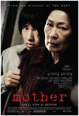
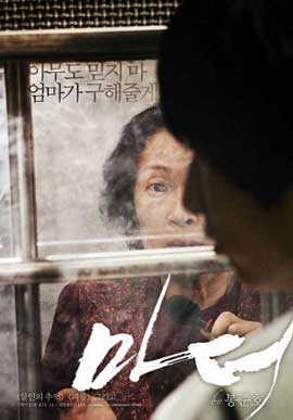
The colours in these film poster are dull and dark we only find light on the two characters faces these colours signify that this film is a very dramatic and tragic film. These colours represent drama and there facial expression bring more meaning to the colours that are shown. The third poster has more light to it because its a shot from the film it self I can see that the writing in korean matches with the background of the poster were the mother is standing against the window and as for the second poster the title "Mother" stands out from the poster so it visible to be seen far from a distance. There is a conventional rule when it comes to colours and these posters stick to that rule because they have a fixed format on their choosing of colours.


One main symbol I can pick out is the way the son is grabbing hold of the mother this symbolises that there is a strong relationship between them a real connection of mother & son but the way they are positioned in this poster symbolises that there is some dramatic, scary , tragic event occuring. The poster's main figures are once again the main characters Mother & son however the little background we see from them is very dull and dark it doesnt look like a happy place for them at all. In the third poster the background is more heavenly bright and the mother seems very shocked. Its an over shoulder shot of the son which creates that heavy impact on the viewer.

The main figure in this poster are the mother & son because the story also leads around them so they own this poster front to show the audience that its about them. In the case if it was the mother and maybe a father then it wouldnt make sense if the actually film evolved around the mother and son.

Dairy Entry 9

Day 2 was the day that we were going over to my house to shoot the scene with John , Colin ,Linda and friends. Today was the day that I was very nervous because the scene in the house were very important and we had to make sure that everything went as followed on the storyboard. We got to my house at 9am and started off with the brothers coming down the stairs and we did this shot a few times to make sure that it was perfect because that was the opening shot of the film.
Everything else went smoothly the actors/actress participated very well and we got along as a whole team and I felt very happy as an director. Day 2 was longer than Day 1 so it was surely more tiring and the extras in our film for the house scene were a bit disturbing because they wanted to leave early but again I managed to get them under control. We had a few breaks so that everyone could rest and provided them with a few snacks. As an production team I felt that we worked together perfectly fine because everyone did a bit of everything in the team.

Wednesday 23 November 2011

Diary Entry 7

We are close to our shooting day only 8 days away and I feel like we are really ready however the only dilemma thats stopping us right now is a actress to play for Linda's role. We have asked many females but jobs , kids and other things just has them busy so were stuck here. However at last minute we resulted to get my mother to act as Linda in our short film she was busy with work but gave up her time to work along with us. Day 1 of shooting was challenging because our main actor 'John' was running late and we had to folllow our time scheme. Once he had arrived we went off shooting our film location was on school grounds and inside the media department were he bumps into the girl in the corridor.
We had to do various angles and had to keep reshooting over and over again it got quite annoying and tiring but it was for the best of it so we could have variety of shots for the editing process.
We faced challenges like public distrubances when we was shooting at Upney walk in Centre and we had to wait for people to clear out of the way so they wouldnt get caught in our shooting.
Another challenge we had is that the extras in our film for the school scene had to wait around for us to finish with John so they were getting quite impatient however as director I took controle over them and managed to get them to wait for a little while.
From my view Day 1 went smoother than I expected and we managed to finish early as well which gave us time to shoot some extra shots and all these extra shots would have came to use in our editing stage.

Wednesday 16 November 2011

Dairy Entry 8

BELIEVE TODAY WE FINISHED OUR EDITING OF OUR FILM!
Today has brought a lot of stress of my shoulders knowing that we finally finished the whole film stage and its now down to evaluation , poster & review etc. This editing was a very long process however my group worked as a strong team some did more than others however we came out with the best of minds together. I feel happy about our film was always expecting way better however what we did for mature film makers is quite good and I would love to do something like this again in the future.

Film Review Research

FILM REVIEW RESEARCH

I only did a few researches on Online film reviews because I needed a broader knowledge on how reviwes were written and then look at magazine film reviews to see what the layout are set out like therefore these researches on Online film reviews are only for a broader knowledge I did however look at a few of there styles because the template its too much differ from the magazine ones.


I didn’t want to approach the mega film magazine because that’s the usual so I went for the more lower class film magazines and one I found was called Eye for film.
This is company has a very simple layout for their reviews however its very good and easy readable.  It has its star rating and a simple cut out from the film it self to give the audience an insight of what the film is about if they haven’t seen it yet.
On the side there is a pink box with the main details of who was involved in creating the film director, writer, cast etc.


Future movies is another film magazine that has reviews that interest me and what gives its more flare is that its laid out very simple. All the main information about the film itself is laid out on the left hand side and the on the right hand side in the darker box there is the film details e.g. star ratings , director , cast.


BFI is an independent institute and our film would fall under that category so looking at the reviews on this website would be a great inspiration however the reviews on this website is way differ from the bigger film companies. These reviews are just clogged up with a load of information.


The style of writing often attempts to be humorous, especially when giving a negative review and this styles it out to make it more attractive to the readers. It is informal and easy to read, appealing to the mass market. The article is laid out in much the same way as a newspaper, with columns broken up by selected quotes.Total film reviews always have more than one image inserted which makes it interesting because there is a large amount of text and then the images balance it out.
 One unique feature of Total Film is the “predicted interest curve” which informs readers whether the film is interesting all the way through and I will be adding this into my magazine review as well because it gives the audience a another reason to watch it.

Most of the big articles have pictures from the film accompanying them, giving the reader a sense of the film’s mise-en-scene. They usually have some sort of catchy caption to it as well.
 This is another image of a review in total film magazine and this one shows the other similar films and to help the reader determine whether that particular film is one which they would like to see. This the kind of layout I will be going after.

Tuesday 1 November 2011

Kidney Documentary

http://www.youtube.com/watch?v=pr-FFCeYfP8&feature=player_embedded
The Perfect Match : Living Donor Kidney Transplant Story

A childhood friendship...and facebook could save John's life. While on the brink of kidney failure, John reunites with an old friend who suddenly realizes that she has the ability to save John's life. Watch as their friendship and lives are put to the ultimate test. This is an documentary based on John who needs a kidney donation and a friend of his comes and saves his life by donating a kidney to him.
This documentary inspired me and showed me how much emotion and tragedy there is in these situations so this would have be inserted in our film to make it affective.
Opening my mind of how to see this issue and how we can portray it in our film because this is the step John (Ope) take into Manhood so we would have to show this process quick but properly.